Why We Rebuilt Our Website From Scratch
1) Why We Created a New Website and Couldn’t Just “Switch Themes”
When we first identified the need for change, the task seemed simple: “Change the top block and make the call to action more effective.” At face value, this might seem like a quick fix, but we soon realized that this small task revealed much larger underlying issues with the structure and design of the site. The problem wasn’t just one block; it was the entire architecture of the site that needed an overhaul.
Our website had been built over time, with different pages added using various designs and layouts, without any unifying theme or template. Each page was unique in its design, which might sound creative but led to a significant issue: inconsistency. If we went ahead and made a new design for just the top block while keeping the rest of the site as it was, it would mean manually updating that block on over 700 pages and posts. Even worse, this manual process would need to be repeated every time we wanted to make future changes. Imagine the inefficiency of having to comb through hundreds of pages, ensuring each had the latest updates. It quickly became clear that continuing to work with the old site would not be sustainable.
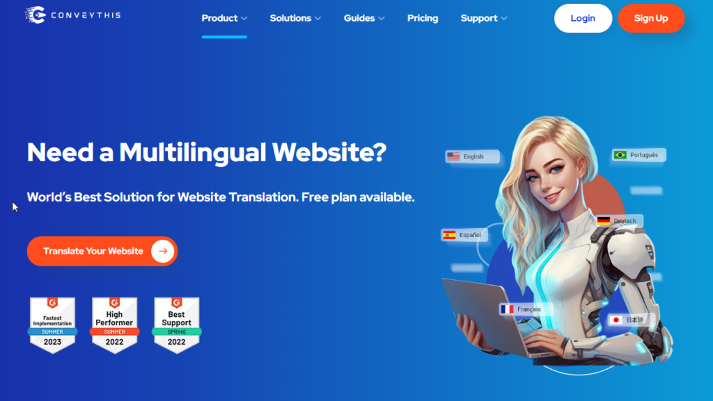
Beyond just the logistics of updating each page, we had to consider the overall user experience. Users today expect seamless, cohesive experiences when they visit a website. If they scroll down a page and see that the design is inconsistent – with each block using different styles – it creates a disjointed and unprofessional impression. Even worse, when a user moves from one page to another and notices that the layout and design are entirely different, it reinforces a sense of disorder.
The inconsistency extended beyond layout. Many of the images on the site were outdated, poorly styled, or even inappropriately generated by neural networks. These images were not in line with modern design standards, and replacing them was another daunting task. The use of bad images reflected poorly on the overall quality of the site, leaving users with a negative impression of the product or service we were offering.
There was no simple way to update the site comprehensively using a tool like Elementor. Each page and block contained its own inline styles, meaning changes couldn’t be made globally. If we wanted to update the style of the site, we would have to go through every single page and manually update each block, which would be time-consuming and inefficient. With this in mind, it became evident that our only solution was to build a new website from scratch. This would allow us to transfer all the content while maintaining the same URLs but with a new, consistent, and easily updatable design.
2) Why We Decided Not to Use Elementor
Elementor is one of the most popular page builders for WordPress. On the surface, it seems like a great tool that allows for quick and easy page creation. However, after working extensively with it, we encountered several limitations that made us decide to move away from Elementor and opt for a custom-built website instead.
Elementor’s Limitations and Challenges:
- Bugs and Glitches: While Elementor offers many useful features, it is not without its technical issues. For instance, when we copied a page and tried to edit it, the new page often looked different from the original, even before making any changes. There were frequent bugs with how elements were displayed, such as the “maximum image width” property not functioning correctly. These glitches made it difficult to ensure consistent styling across pages.
- Too Much Creative Freedom, Leading to Inconsistency: One of Elementor’s key selling points is the ability to customize everything. However, this flexibility can be a double-edged sword, especially when multiple editors are working on the site. It’s easy for non-professionals to unintentionally create pages with inconsistent designs. For example, we saw instances of editors using pink text on pink buttons or adding flying orange triangles in the background, resulting in a cluttered and confusing design. Without a strict design system in place, it became impossible to maintain a cohesive visual identity.
- Limited Customization for Advanced Functionality: While Elementor excels in basic page building with text and images, it becomes more challenging when you need to add custom functionality. We often found ourselves limited to the built-in blocks, which were difficult to customize for more complex features. As our needs grew beyond basic layouts, Elementor’s limitations became increasingly apparent.
- Bloated Code and Performance Issues: Elementor’s method of building pages introduces excessive nesting of elements. For example, Elementor automatically generates multiple
<div>containers within other<div>elements, each with its own set of styles. This results in a bloated structure that negatively affects loading speed, page performance, and ultimately the website’s SEO ranking. When we ran speed tests, the results were consistently poor, and the heavy code generated by Elementor was largely to blame. - No A/B Testing Capabilities: In today’s digital landscape, A/B testing is essential for optimizing user experience. However, Elementor doesn’t offer the ability to show different versions of the site to different users. Everyone sees the same site, which limits our ability to test and fine-tune design elements like colors, button shapes, and background imagery. Without this functionality, we couldn’t optimize the site based on real user behavior.
- Database Bloat: Perhaps one of the most significant drawbacks of Elementor is how it handles styles and content. Elementor stores styles, nested structures, and other unnecessary tags mixed in with the content in the database. This leads to a bloated database that doesn’t get cleaned up even when Elementor is disabled or uninstalled. As a result, switching to a new theme or framework doesn’t solve the problem – those styles remain embedded in the pages, continuing to cause issues.
With all of these challenges in mind, it became clear that we needed a more robust solution. We made the decision to build a new, independent website without Elementor, opting for a more sustainable and flexible approach.
3) How to Create a Page on the New Site
Building the new site from scratch gave us the opportunity to establish a clean, streamlined process for creating pages. In the new system, creating a page is straightforward:
- Log in to the WordPress admin panel and click Pages -> Add New Page.
- You’ll see the standard WordPress editor, where you can write or paste text, add links, and upload images.
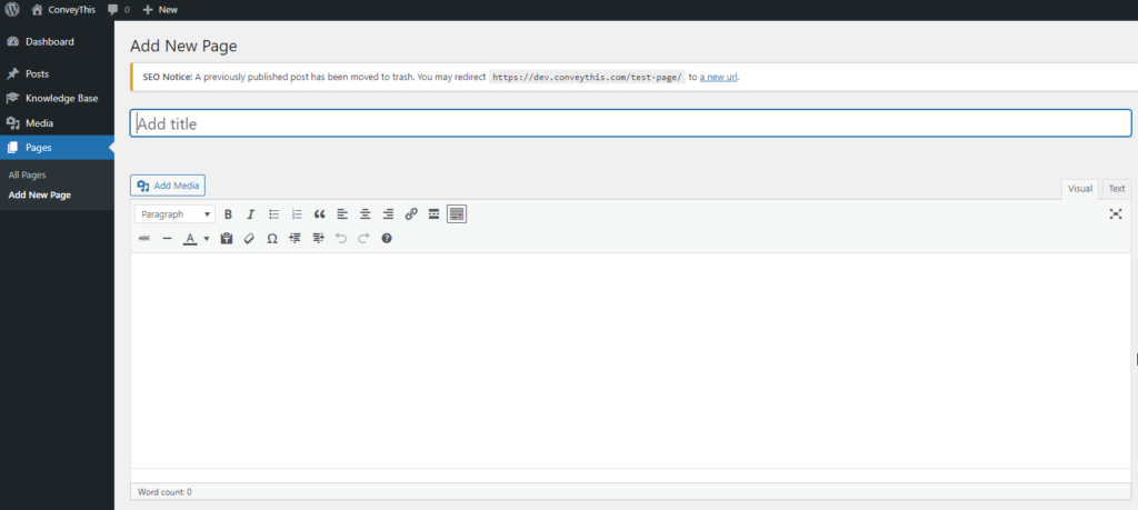
This process is simple but flexible. Instead of relying on Elementor’s complicated block system, the content editor in WordPress is much cleaner, allowing for quick updates and easy customization. Below the editor, there are settings for Advanced Custom Fields (ACF), which are already configured to maintain consistency across the entire site.
ACF allows us to create flexible content sections, with blocks like Content 1…Content 15, where you can easily set the title, text, image, and button labels for each section of the page. These blocks automatically alternate the positioning of images and text, ensuring that the layout remains visually engaging without requiring manual adjustments.
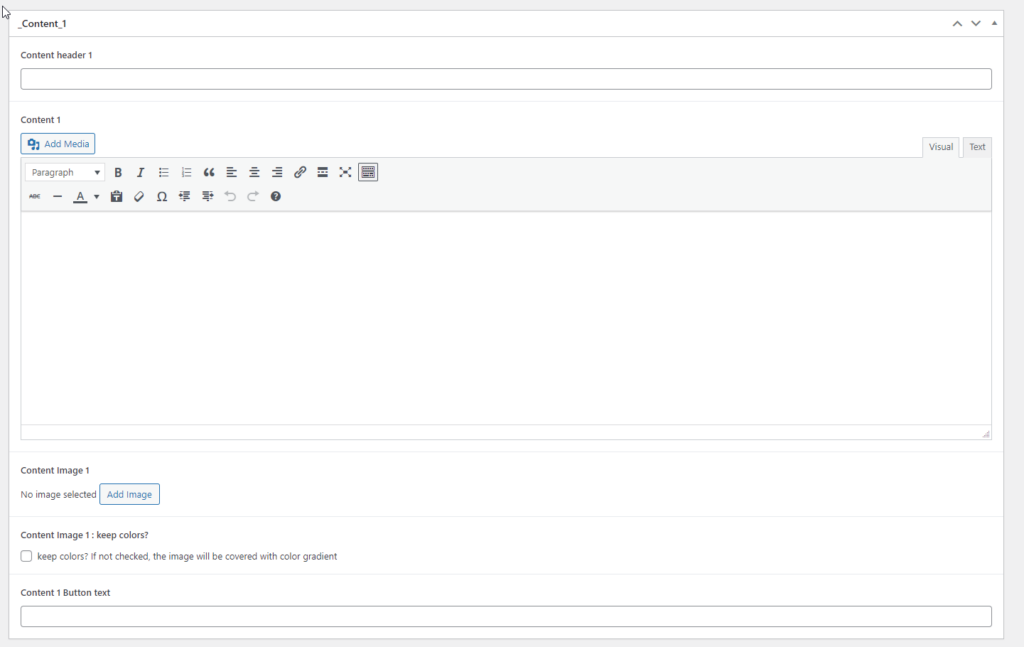
For images, we implemented a color-matching system that automatically applies a gradient in the site’s main colors. This ensures that all images align with the overall aesthetic. For logos or screenshots where the colors need to remain intact, there’s a “keep colors” option that overrides the gradient.
This system simplifies content management while maintaining design consistency across all pages.
4) How to Create a New Post
Creating posts on the new site follows the same streamlined process as creating pages, with a few key differences:
- Posts have URLs that include ../blog/.., distinguishing them from pages.
- In the right sidebar, a block automatically displays the three latest articles, helping keep the blog dynamic and engaging.
The template for all posts is located in the file template-parts/content/content-single.php, which handles the structure and layout of each blog post. This consistent template allows for easy updates and ensures that all posts adhere to the same design guidelines.
5) Advanced Custom Fields (ACF)
ACF has been an essential part of our new website’s development. It allows us to create custom fields that can be easily managed through the WordPress admin panel. Fields like content_1 are referenced in the PHP code, allowing us to dynamically pull in the correct content for each page and post.
This flexibility is critical for ensuring that we can manage and update the site efficiently while still providing room for customization when needed.
6) A/B Testing
One of the most significant improvements we made with the new site was the implementation of A/B testing. A/B testing allows us to compare two versions of the site to see which performs better with users. This can include testing different colors, button shapes, backgrounds, or even layouts.
We implemented this functionality using GET parameters in the URL. For example, two identical advertising campaigns can be created, but with different URLs:
https://www.conveythis.com/?param=1
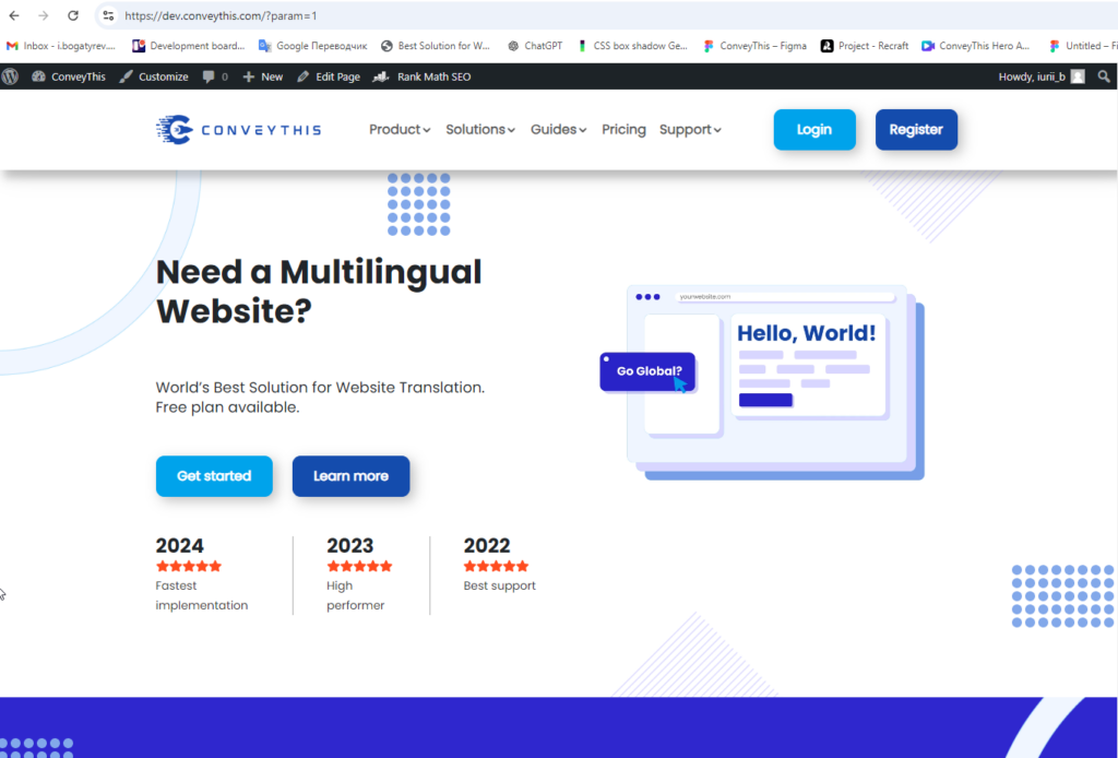
https://www.conveythis.com/?param=2
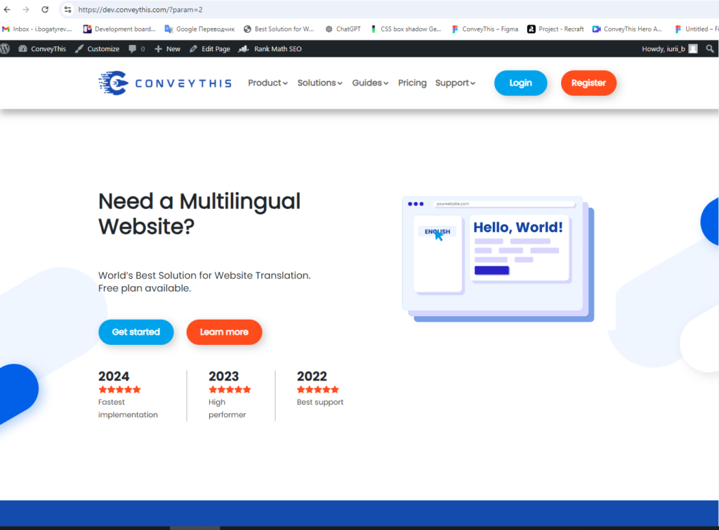
When users click on these links, the parameter is saved in a cookie. Depending on the value of the parameter, the site will show different versions of the page, such as different button colors or background images. This allows us to gather valuable data on user preferences and behaviors.
All events are logged in a .csv file, as well as in a MySQL database, allowing us to analyze the data and make informed decisions about site improvements.
7) The functions.php File
- Custom Post Types and Taxonomies
One of the key uses of the functions.php file was to create custom post types and taxonomies, which allowed us to organize content more effectively. Instead of relying solely on the default WordPress structure (pages and posts), we introduced custom types for specific content, such as case studies, testimonials, or product features. This not only kept our content better organized but also improved the user experience by making it easier to navigate and find relevant information.
For example, to create a custom post type for case studies, we added the following code in functions.php:
function create_case_study_post_type() {
register_post_type( 'case_studies',
array(
'labels' =>array(
'name' => __( 'Case Studies' ),
'singular_name' => __( 'Case Study' )
),'public' => true,
'has_archive' => true,
'rewrite' => array('slug' => 'case-studies'),
)
);
}
add_action( 'init', 'create_case_study_post_type' );
This created a new post type called “Case Studies” that behaved similarly to regular posts but with its own archive and taxonomy structure.
- Loading External Scripts and Styles
Another critical use of functions.php was to load external scripts and styles, ensuring that our website had all the necessary libraries and frameworks. For instance, we integrated libraries like Slick.js for sliders and AOS (Animate on Scroll) for smooth animations. By selectively loading these assets only when they were needed (e.g., on specific pages or templates), we reduced unnecessary bloat and improved page load speeds.
Here’s how we handled the loading of styles and scripts:
function load_custom_scripts() {
// Load Slick slider for specific templates
if( is_page_template('template-slider.php') ) {
wp_enqueue_style( 'slick-css', get_template_directory_uri() . '/css/slick.css' );
wp_enqueue_script( 'slick-js', get_template_directory_uri() . '/js/slick.min.js', array('jquery'), '', true );
} // Load AOS animations site-wide
wp_enqueue_style( 'aos-css', get_template_directory_uri() . '/css/aos.css' );
wp_enqueue_script( 'aos-js', get_template_directory_uri() . '/js/aos.js', array('jquery'), '', true );
}
add_action( 'wp_enqueue_scripts', 'load_custom_scripts' );
By using conditional checks (e.g., is_page_template()), we ensured that unnecessary scripts were not loaded site-wide, thus optimizing performance.
- Custom Shortcodes
To improve flexibility for non-technical users managing the site content, we added custom shortcodes via functions.php. These shortcodes allowed users to easily insert complex functionality or styled elements without needing to touch the code. For example, we created a shortcode for adding custom buttons anywhere on the site:
[REDACTED]
This shortcode made it easy for editors to add buttons with custom text and URLs, allowing for quick adjustments without breaking the design.
8) Handling SEO and Site Speed
A major focus during the website overhaul was improving SEO and overall site performance. The original site, built using Elementor, had issues with slow loading times and suboptimal SEO practices due to bloated code and unoptimized images.
Improving SEO
To ensure our new site was SEO-friendly, we implemented several best practices right from the start:
- Semantic HTML: We carefully structured the site’s HTML with proper use of header tags (
<h1>,<h2>, etc.), ensuring that search engines could easily parse and understand the content hierarchy. This is particularly important for both SEO rankings and accessibility. - Meta Tags and Open Graph Data: We leveraged the Yoast SEO plugin to handle meta titles, descriptions, and Open Graph data for social sharing. By using Yoast, we ensured that each page and post had optimized metadata, which is crucial for search engine visibility and click-through rates from social media platforms.
- Schema Markup: Using the functions.php file, we added custom schema markup for structured data, improving how search engines display our pages in search results. For example, we included schema for articles, case studies, and products, helping search engines better categorize our content.
function add_schema_markup() {
echo '<script type="application/ld+json">
{
"@context": "http://schema.org",
"@type": "Organization",
"name": "ConveyThis",
"url": "https://www.conveythis.com",
    "logo": "https://www.conveythis.com/logo.png",

"sameAs": [

"https://www.facebook.com/conveythis",

"https://twitter.com/conveythis"

]

}

</script>';

}

add_action( 'wp_head', 'add_schema_markup' );
Site Speed Optimization
Performance is a critical factor not only for user experience but also for SEO rankings. We took several steps to improve site speed:
- Image Optimization: We utilized modern image formats like WebP, which offer better compression rates than traditional formats like PNG and JPEG. All images were served in the appropriate size based on the user’s screen resolution, ensuring fast load times even on mobile devices.
- Lazy Loading: By implementing lazy loading for images, we ensured that only the images visible on the user’s screen were loaded initially. Additional images would load as the user scrolled, reducing initial page load times.
- Caching and Minification: We used WP Rocket for caching, minification, and compression of HTML, CSS, and JavaScript files. WP Rocket helped us achieve faster load times by reducing the overall file size and serving static cached versions of pages to repeat visitors.
9) Database Optimization and Cleanup
The old website had accumulated a significant amount of “junk” data due to Elementor’s bloat and inefficient database structure. To ensure the new site ran smoothly, we performed a thorough database cleanup and optimization.
- Removing Old Elementor Data
As mentioned earlier, even after deactivating Elementor, its styles, and settings were still embedded in the database. We used custom queries to delete this excess data and clean up the database. Additionally, we removed any unused media files, post revisions, and expired transients that had accumulated over time.
- Database Indexing
We also optimized the database by adding indexes to frequently queried columns, ensuring that database queries were faster and more efficient. For example, adding an index to the post_date column sped up queries related to recent posts, improving the performance of our blog pages.
Conclusion
The decision to build a new website from scratch was driven by the limitations and inefficiencies of the old site. Simply switching the theme was not a viable option due to design inconsistencies, bloated styles, and performance issues caused by Elementor. By creating a new site with custom development and Advanced Custom Fields, we achieved a more efficient, cohesive, and professional website that enhances the user experience while enabling streamlined updates and A/B testing functionality. This new site provides a solid foundation for future growth and improvements.
Translation, far more than just knowing languages, is a complex process.
By following our tips and using ConveyThis, your translated pages will resonate with your audience, feeling native to the target language.
While it demands effort, the result is rewarding. If you’re translating a website, ConveyThis can save you hours with automated machine translation.
Try ConveyThis free for 3 days!
 No card details


