


Inspiring Ecommerce Sites: Where Design Meets Functionality
Certain websites leave a lasting impression on their visitors, making them unforgettable due to the impact they create. What is the secret behind such memorable sites? The answer is simple: exceptional design. Great design goes far beyond mere aesthetics. It’s about creating a welcoming, friendly, and persuasive environment that makes visitors feel at ease and encourages them to explore further. A well-designed site draws people in, guides them through the content, and creates an experience that resonates long after they leave.
At its core, design is an essential tool for communicating your brand’s message. Every element on a website—whether it’s the choice of color schemes, typography, layout, or even interactive elements—tells a story. Through design, you convey crucial information about your business, values, and vision, often without saying a single word. It’s through these design choices that you speak directly to your audience, shaping their perception of your brand.
In the digital world, first impressions matter more than ever. Studies have shown that visitors form an opinion about a website in just 0.05 seconds[4]. That’s a fraction of a second to make an impact. Within this brief moment, they decide whether to stay and engage with your content, explore your products, and potentially make a purchase, or leave and never return. This is why great design is so powerful— it influences the decision-making process immediately and significantly.
The Growing Ecommerce Landscape
The ecommerce landscape has witnessed exponential growth, with online revenue rising year after year. By 2019, ecommerce accounted for over 16% of total retail sales[5], and this trend continues as more consumers turn to digital shopping. This expansion is a sign of a thriving market, but it also means increased competition. Ecommerce business owners face the challenge of not just attracting traffic, but converting visitors into customers. To succeed in this competitive environment, standing out is crucial.
In the online realm, where physical stores don’t have a direct impact, the design of a website becomes the key differentiator. A well-designed site can create trust, engage visitors, and drive sales, while a poorly designed one may lead to abandonment. Every element—color, layout, typography, and functionality—plays a vital role in shaping the user’s experience.
Each year, the Awwwards recognize the best websites across different industries, including ecommerce. These awards highlight the power of great design and the impact it has on online business. Ecommerce websites, in particular, showcase the perfect blend of creativity, usability, and brand storytelling. Let’s take a closer look at four outstanding nominees that demonstrate how exceptional design can elevate an ecommerce site and turn it into a powerful marketing tool.
Inspiring Ecommerce Sites
1. Jorik: A Masterclass in Elegant Simplicity and User Engagement[6]
Jorik’s website is a perfect example of how a strong, consistent brand identity can be seamlessly translated into an online experience. The design effortlessly blends simplicity with bold animation, showcasing the brand’s ethos in a way that is both visually stunning and highly functional. The site’s minimalism doesn’t just serve aesthetic purposes but is a deliberate choice to keep the focus squarely on the product—designer apparel that demands attention.

One of the standout features of the Jorik website is its highly responsive design. Unlike static websites that remain unchanged regardless of how the user interacts, Jorik’s site is alive and reactive. The subtle movement of the banner in response to the cursor and the interactive text boxes that appear when hovering over products create a sense of dynamism and engagement. This level of interactivity isn’t just a nice touch; it enhances the user experience by making the website feel more personal and responsive to their actions. This fluid, responsive design draws visitors in, making them feel as though they’re part of the experience rather than just passive observers.
The design of the site is thoughtfully crafted to highlight the products—large, dynamic photos of the designer apparel take center stage. These high-quality images are not only visually captivating but also play a critical role in conveying the brand’s luxurious and modern aesthetic. The clothing is showcased in its full glory, with each piece standing out against the backdrop of the site’s minimalist, mostly monochrome color palette. The restrained use of color allows the products to be the focal point of each page, making them feel more prominent and desirable. The occasional splash of striking color adds emphasis and variety, drawing attention to specific elements and providing a subtle contrast that elevates the overall design.
What truly sets the Jorik website apart, however, is how seamlessly the design mirrors the brand’s identity. The minimalist aesthetic, the dynamic animations, and the high-end product photography all come together to tell the story of the brand. Visitors don’t just see clothes; they see a carefully curated lifestyle, an embodiment of the designer’s vision. This kind of cohesive design experience elevates the entire interaction, turning a simple online shopping trip into a brand immersion.
When a website so perfectly aligns with the brand’s values, it’s not just a site—it’s an extension of the brand itself. The user experience becomes part of the brand’s narrative, reinforcing the ethos of simplicity, sophistication, and modernity. Every design choice—from the layout to the interactive elements—works together to create a cohesive, engaging environment that invites users to explore further and connect with the brand on a deeper level.
2. Déplacé Maison: A Bold and Dynamic Expression of Urban Lifestyle[7]
Déplacé Maison’s website is a vivid celebration of energy, movement, and urban culture, capturing the spirit of the brand through a dynamic and engaging design. From the moment visitors land on the homepage, they are immersed in a design that immediately sets the tone for the brand’s identity—bold, playful, and full of life. The first interaction is with a custom animated cursor that leaves a fading trail as it moves across the page, adding a layer of interactivity and fun. This subtle yet effective detail not only makes the website feel more alive but also serves as an embodiment of the brand’s urban streetwear ethos, inviting visitors to explore and engage with the content in a more playful, immersive way.

This unique cursor animation is just the beginning of a website that thrives on movement. The design itself exudes energy, encouraging visitors to engage with the world around them. The entire site seems to urge movement, from the vibrant colors and dynamic animations to the layout that flows effortlessly. It’s not just a website—it’s an invitation to explore, to interact, and to experience the brand in a way that mirrors the constant motion and excitement of urban life. This sense of motion and exploration speaks directly to the brand’s target audience, inspiring them to delve deeper into the content and discover the world of Déplacé Maison.
One of the most striking features of the website is its use of photography. Instead of traditional product shots, the photos have been creatively edited to resemble illustrations, transforming the brand’s lookbook into a vibrant, comic-book-style gallery. This artistic approach not only adds a unique visual flair but also connects directly with the youthful, creative audience the brand caters to. The illustrated style resonates with the brand’s streetwear culture, which often draws on bold, graphic design elements and a sense of rebelliousness. This creative choice effectively amplifies the brand’s message, making it instantly recognizable and relatable to its audience.
The use of illustration also provides a sense of depth and narrative to the images. Each photo feels like part of a larger story, with the stylized effects enhancing the emotions conveyed by the clothing and accessories. The juxtaposition of real-world fashion with illustrated elements blurs the line between reality and artistic interpretation, creating a sense of fantasy that invites the audience to immerse themselves in the world of Déplacé Maison. This blending of art and fashion captures the brand’s youthful, boundary-pushing spirit, making the website not just a store but a creative space that inspires visitors.
3. White Tail Gin: A Journey of Discovery in Every Scroll[8]
White Tail Gin’s website is a masterclass in creating an immersive, sophisticated online experience that revolves entirely around a single product. The design takes a unique approach by dedicating the entire site to telling the story of White Tail Gin, transforming a simple ecommerce platform into an experiential journey. The website’s layout is meticulously crafted, with every design element seamlessly tied together through the flow of the full-page scroll. This thoughtful structure makes the website feel almost infinite—like a space where visitors could keep scrolling indefinitely, exploring the story of the product without ever reaching a dull moment. In fact, reaching the end of the page feels like an anticlimax, as the experience has been so thoroughly captivating that one could easily imagine spending hours discovering more.

The website’s design is built around a single, innovative feature: the “discover mode.” Instead of the traditional structure of multiple tabs or menus, the entire narrative of White Tail Gin is revealed progressively as the visitor scrolls down the page. This design choice encourages the user to engage with the content organically, as each scroll reveals more about the brand, its origins, and the craftsmanship behind the gin. The “discover mode” creates a sense of excitement and curiosity—much like exploring a new world. The storytelling doesn’t just inform visitors about the product; it immerses them in the experience, making them feel as though they are personally uncovering the gin’s story as they journey through the website.
The journey culminates in the shop section, which feels like the end of an adventure. This approach is inspired by the narrative structures often found in museums and amusement parks, where visitors are led through an experience that builds excitement and curiosity, only to encounter the gift shop at the end, where they can take home a piece of the experience. In this case, the “gift” is the opportunity to purchase White Tail Gin itself. This clever design mirrors the consumer journey at physical attractions, where the anticipation of the story reaches its peak, and the shop becomes the natural conclusion, allowing visitors to take part in the narrative by purchasing the product they’ve just learned so much about.
The overall design of the White Tail Gin website exudes a sense of calm sophistication. The aesthetic is refined, with muted colors, elegant fonts, and smooth animations that create a soothing, mature atmosphere. The site feels like a curated experience, inviting users to relax and unwind as they explore the world of White Tail Gin. It’s reminiscent of the leisurely enjoyment one might expect from a holiday trip, where everything is carefully designed to provide both indulgence and discovery. The experience feels like a portal into a world of luxury and relaxation, reinforcing the premium nature of the gin and its brand.
4. Uruoi Skincare: A Harmonious Blend of Simplicity and Science[9]
Uroi Skincare’s website is a beautifully crafted example of how to present complex information in a visually appealing and user-friendly manner. This Japanese brand, known for its minimalist philosophy and scientifically-backed ingredients, faces the challenge of conveying a wealth of information about its products without overwhelming visitors. As skincare continues to grow in sophistication, with more consumers becoming well-versed in the intricate details of ingredients and their effects, Uroi’s website design takes on the responsibility of communicating this complexity in an accessible and aesthetically pleasing way.
One of the defining features of the Uroi website is its ability to balance an extensive range of products and information with a clean, minimalist aesthetic. The brand’s design philosophy is rooted in the principles of Japanese minimalism, which focuses on simplicity, elegance, and functionality. These values are evident in the site’s layout, which prioritizes clean lines, ample white space, and a restrained color palette that doesn’t overwhelm the senses. The minimalist design invites users to engage with the content without feeling crowded by excessive details. Despite the complexity of the skincare industry and the depth of information Uroi provides, the website creates an atmosphere that feels serene, calming, and easy to navigate.
To manage the challenge of presenting such detailed product information, the designer used negative space and subtle animations as tools to enhance the user experience. Negative space, or white space, plays a pivotal role in allowing the content to breathe, giving each product and piece of information the room it needs to shine. This approach not only makes the website more visually pleasing but also ensures that visitors aren’t bombarded with information all at once. Instead, they can absorb details gradually, focusing on what interests them most without feeling rushed or overwhelmed.
In addition to the use of negative space, the website incorporates smooth animations that guide the user through the content in an intuitive way. These animations are not merely decorative—they serve to enhance the flow of information, providing subtle cues to help users navigate through different sections of the website. For example, when hovering over product descriptions or ingredients, animations gently reveal more details, making it clear that there is more to explore without cluttering the page with excessive text. This dynamic interaction invites users to engage with the website and encourages them to learn more, all while maintaining the website’s calm and refined atmosphere.
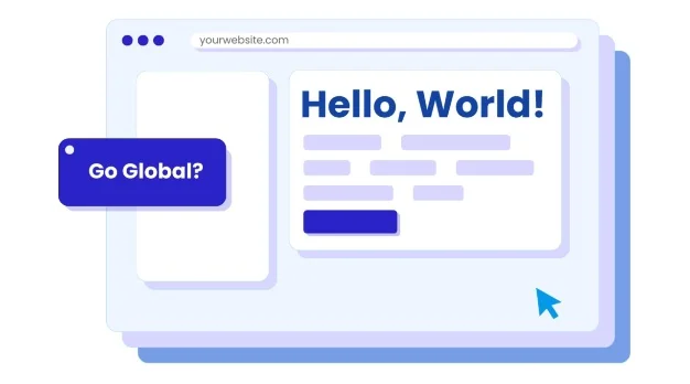
The Key to Expanding Your Ecommerce Business Globally
As the global ecommerce market continues to expand, standing out among competitors becomes increasingly important. The ecommerce websites we discussed earlier serve as shining examples of how outstanding design can elevate a brand and create a memorable user experience. But, while an exceptional website design can captivate and engage visitors, there is another critical element that can significantly impact your business’s growth: going multilingual. Simply offering international shipping isn’t enough to guarantee success in the global market. If your customers can’t understand your website in their own language, you may be losing out on a large portion of potential revenue.
Why Multilingual Websites Matter
The importance of multilingual websites cannot be overstated in today’s interconnected world. When visitors encounter an ecommerce website in a language they don’t understand, the barriers to purchasing become immediate and obvious. From the fear of misunderstanding product descriptions to concerns about the payment process, these obstacles can create a sense of hesitation. Potential customers may want to make a purchase, but the uncertainty caused by language differences can prevent them from following through.
In fact, language barriers are one of the leading reasons why international customers abandon their carts and leave websites without completing transactions. If your website doesn’t cater to their language preferences, they may look for alternatives that offer a more comfortable shopping experience. This means that businesses who fail to localize their websites are missing out on a significant global audience—an audience that could be eager to buy, but is deterred by the inability to easily navigate your site.
Furthermore, having a multilingual website doesn’t just improve user experience—it also benefits your site’s SEO (Search Engine Optimization). Search engines, like Google, tend to prioritize websites that are tailored to specific language groups, as they’re seen as more relevant and accessible to the users within those demographics. By offering content in multiple languages, your site is more likely to rank higher in search results, increasing its visibility and driving more traffic. More language options mean more opportunities for international customers to find your site, browse your products, and make purchases.
Start Selling Globally with Ease
One of the biggest misconceptions about creating a multilingual website is that it’s a complicated, expensive process that requires advanced technical skills. However, with the right tools, this process can be quick and hassle-free. Services like ConveyThis allow you to easily translate your website’s content into multiple languages with just a few simple steps. Whether you’re looking to offer two languages or expand to many more, ConveyThis simplifies the process—no coding required.
With ConveyThis, your site will automatically start displaying in the newly selected language as soon as you make the switch. This seamless transition ensures that international customers can immediately access your site in their preferred language, reducing the friction that may have once discouraged them from making a purchase. The automatic translation process is designed to save time and effort while still providing accurate and useful content for your global audience.
Enhance Your Website’s Appeal and Reach
While automatic translations are an excellent starting point, they may not always capture the nuances of your brand’s voice or the specific needs of your target audience. That’s where ConveyThis truly shines. After the initial automatic translation, you can refine your site’s content with the help of professional translators and editors. ConveyThis offers access to expert language specialists who can ensure your most critical pages—such as your homepage, product descriptions, and checkout process—are polished and reflect your brand’s identity in every language.
By offering professionally edited translations, you can ensure that your site’s content is not only accurate but also culturally relevant. This attention to detail will help you build trust with your international customers, as they’ll feel more confident purchasing from a site that speaks their language both linguistically and culturally.
Moreover, ConveyThis provides ongoing support throughout the process, helping you manage the technical and linguistic challenges that come with creating a multilingual ecommerce site. From ensuring compatibility across different platforms to maintaining the integrity of your site’s design in various languages, you’ll have the assistance you need to navigate the complexities of running a global online store.
Conclusion:
In the fast-paced world of ecommerce, where competition is fierce and every detail counts, design has the power to make or break your online store. Great design is not just about looking good; it’s about creating a seamless, immersive experience that speaks to your audience, tells your brand story, and persuades visitors to take action. Whether it’s through bold animations, responsive layouts, or intuitive navigation, the design of your website can have a profound impact on how visitors perceive your brand and whether they decide to stay, explore, and ultimately make a purchase.
The four ecommerce websites we explored—Jorik, Déplacé Maison, White Tail Gin, and Uruoi Skincare—are prime examples of how exceptional design can elevate a brand and transform a visitor into a customer. Each of these websites reflects the brand’s identity in unique ways, from playful cursor animations to immersive storytelling through scrolling. Their designs aren’t just visually appealing—they are purposefully crafted to evoke emotions, convey messages, and enhance user engagement.
However, design alone isn’t enough in today’s globalized marketplace. To truly maximize your ecommerce potential and reach customers worldwide, embracing a multilingual approach is crucial. A multilingual website not only caters to a broader audience but also builds trust with international customers who may be hesitant to make purchases in a foreign language. By offering content in your customers’ native languages, you eliminate barriers, making them feel more comfortable and confident in their purchasing decisions. Moreover, search engines will reward your site with better rankings, increasing visibility and driving more traffic to your online store.
The good news is that creating a multilingual website is easier than ever with services like ConveyThis. You don’t need to be a coding expert or overhaul your website’s layout. With just a few simple steps, you can offer multiple language options, helping your business expand globally with minimal effort. And as your website grows, you can refine and polish the translations to ensure your message remains clear, accurate, and professional.
Additional Resources:
- ConveyThis Integrations – To explore compatibility with WordPress.
- How to Translate WordPress – For more guidance.
- Help Guide for Translating WordPress Websites – For step-by-step support.
- Why First Impression Matters – Learn how to make a great one with visual design.
- An Article On Global Ecommerce Sales – For more information.
- Jorik – See how Jorik’s website blends minimalism with bold animations to reflect its brand ethos..
- Déplacé Maison – Discover how Déplacé Maison’s design energizes visitors with its urban, youthful style.
- White Tail Gin – Explore White Tail Gin’s immersive website that uses storytelling to guide users toward purchasing.
- Uruoi Skincare – Find out how Uroi’s minimalist design presents complex skincare information in a user-friendly way.